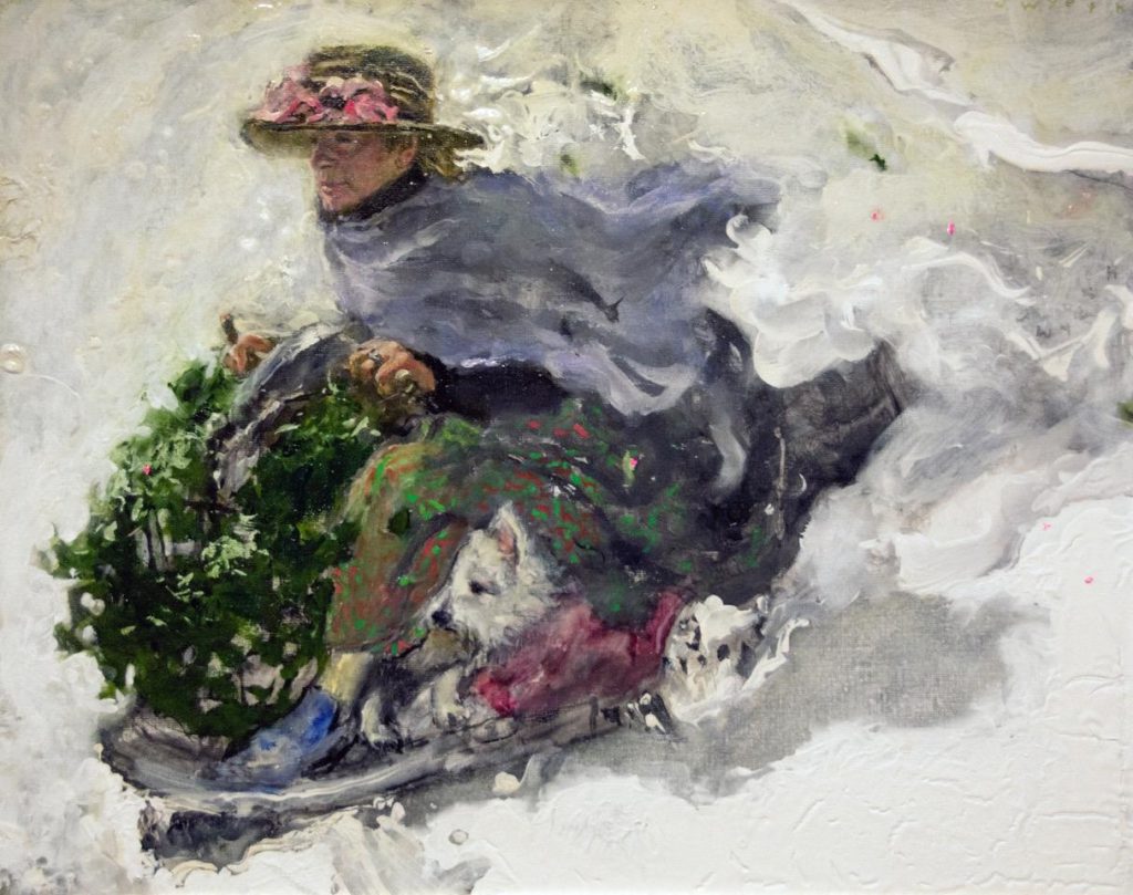
André Giroux’s Santa Trinità dei Monti in the Snow
Currently the National Gallery of Art in Washington, D.C. is hosting a very interesting show of plein air paintings. The show consists of 90 paintings by about 70 different artists, all painting between 1780 and 1870. I found this show particularly appealing because I could study some very good paintings, as well as directly compare different styles and techniques. As a bonus, I discovered two examples where different artists painted the same scene, though not at the same time.
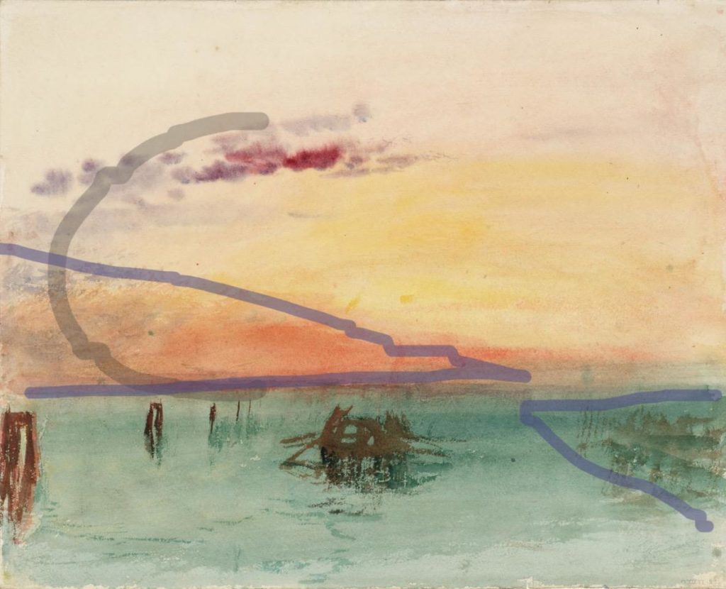
Two almost universal techniques in this collection were the starting of the painting with a pencil drawing, something one sees more with watercolor, and a thin application of purple paint for distant mountains.
In contrast to the widespread difficulty many of the artists had with trees and clouds, one Constable cloud study demonstrates a successful technique for handling clouds. He used a fairly stiff brush with minimal paint, only loading up the brush enough to create a few highlights. This gives the clouds a soft-edged feeling.
Clouds are water vapor which is least dense along the cloud edge, where there is a temperature boundary and, thus, a condensation boundary. What we see as a cloud is the reflection of light off the water droplets. I recognized that a similar technique which was applied to trees, or more specifically their foliage, was also successful, but for a different reason. Leaves themselves have a hard edge, but as a mass there is no continuous line at their edge. Instead, foliage edge is a series of short little lines. The similarity of foliage with clouds is the variation of the density of the mass.
The three outstanding gems in the show were Constable’s cloud study, Augustus Egg’s courtyard painting – because of its handling of leaves – and André Giroux’s Santa Trinità dei Monti in the Snow. In the latter painting Giroux catches the light’s effect on the rooftop snow. He must’ve either been very lucky and have already started the painting before it snowed, or done a very good, quick study drawing, because the moment captured had to have been very fleeting. Either way, Santa Trinità dei Monti in the Snow is the best of these top three paintings.